GSMS — Brand Identity Redesign
Golden State Medical Supply · Brand Strategy, Logo Design & Guidelines
Project Details
CLIENT
Golden State Medical Supply (GSMS)
INDUSTRY
Pharmaceutical / Government Contracts / VA Supply Chain
DELIVERABLES
Logo redesign, brand guidelines, color system, typography, trade show & marketing materials
STATUS
Launched — ongoing creative partnership
The Brief
Golden State Medical Supply had a problem its leadership recognized clearly: their brand looked like 2003. A serif wordmark, a pill bottle icon, and a tagline that said 'incorporated' — functional, but generic. As a licensed repackager of generic drugs with government contracts focused on the U.S. Department of Veterans Affairs, GSMS needed an identity that matched their ambitions, not their past.
The brief: modernize without losing the equity built into a decade of brand recognition. Keep the purple and gold. Make it feel like a company built for what's next.

BEFORE & AFTER
THE APPROACH
Continuity through transformation
The strategy was evolution, not revolution. Rather than starting from scratch, the redesign preserved the purple and gold color story — recognizable and carrying institutional weight — while completely modernizing the execution.
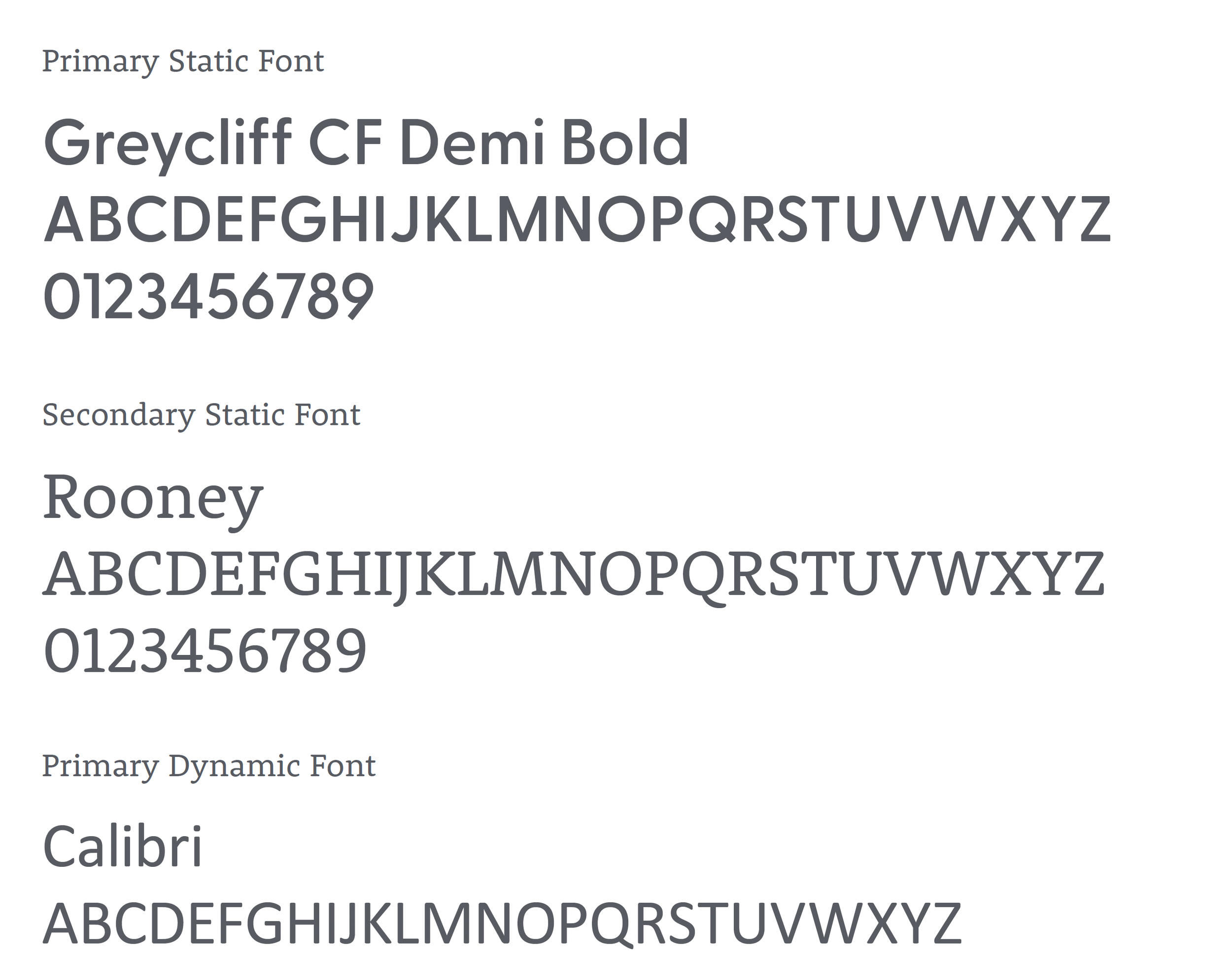
Typography System
A two-track type system was built for practicality: Greycliff CF Demi Bold and Rooney for designed static materials (ads, print, cards), and Calibri for internal dynamic documents — ensuring consistency without requiring font licensing across the entire organization.
Logo Design — Bridge & Partnership
The new wordmark moves from rigid uppercase serif to rounded lowercase letterforms — approachable, modern, and built for digital and print alike. Two variants were developed: Bridge, which emphasizes the visual connection between the G and S as a metaphor for the company-partner relationship; and Partnership, which uses gold accent triangles within the letterforms as a nod to the original gold without being literal.

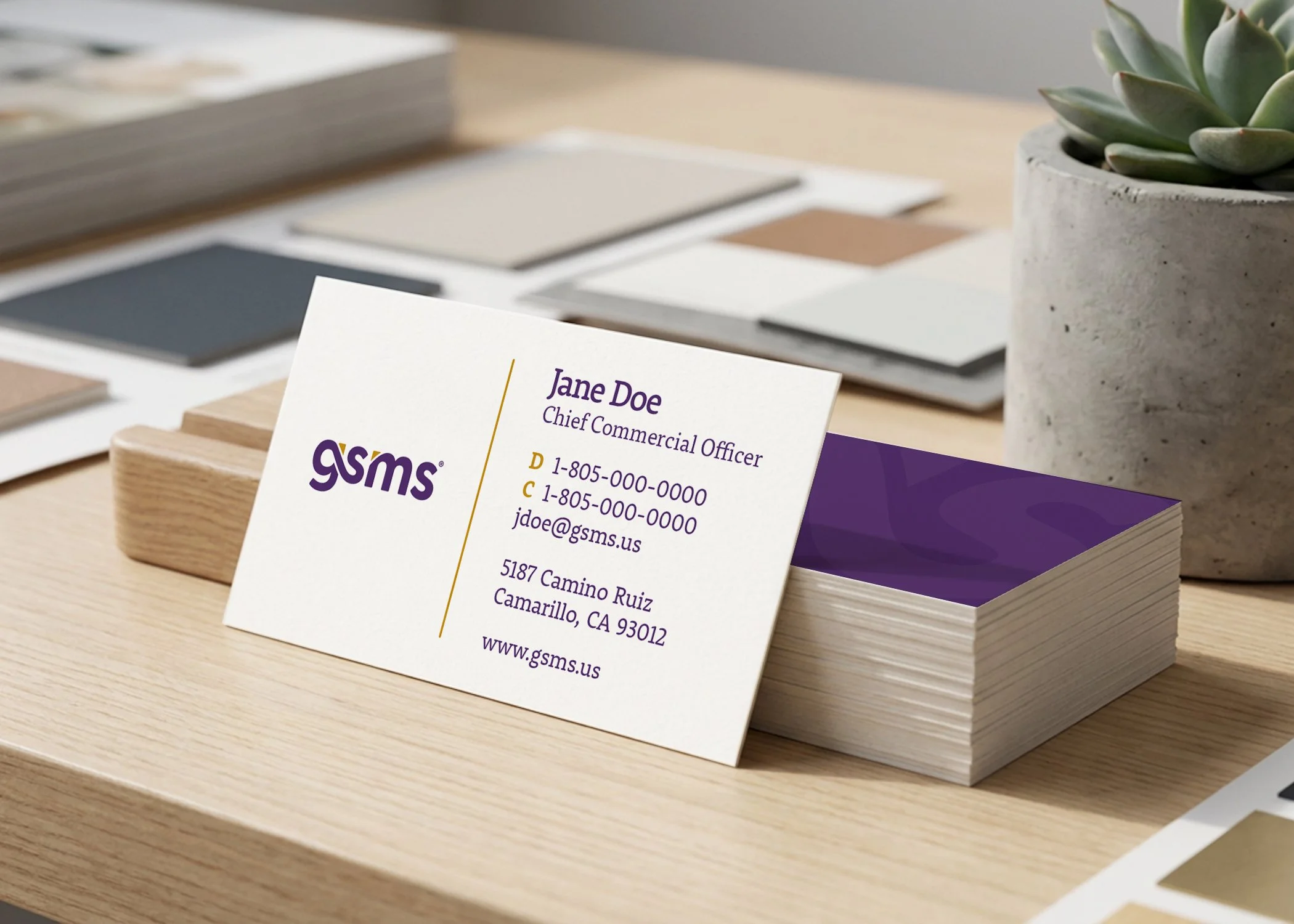
Color System
Pantone 269 C (deep purple) and Pantone 1245 C (gold) were retained as primary brand colors — purple dominant, gold as accent. A secondary palette including teal, magenta, muted purple, and near-white expands the brand's expressive range across applications.
The Result
A brand the company is proud to put in front of the VA
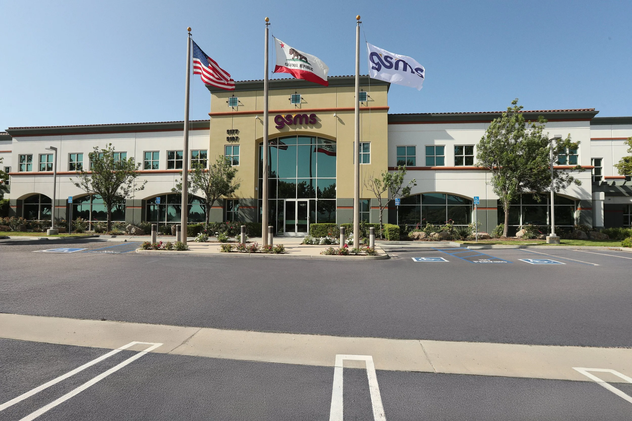
The updated identity launched to strong internal and external feedback. The new logo was adopted across all company touchpoints, and the brand guidelines gave the GSMS team a clear, scalable system to maintain consistency going forward.
The engagement evolved into an ongoing creative partnership — Allan continues to support GSMS with trade show design, marketing materials, and campaign assets.
Have a similar project? Let's build something together.